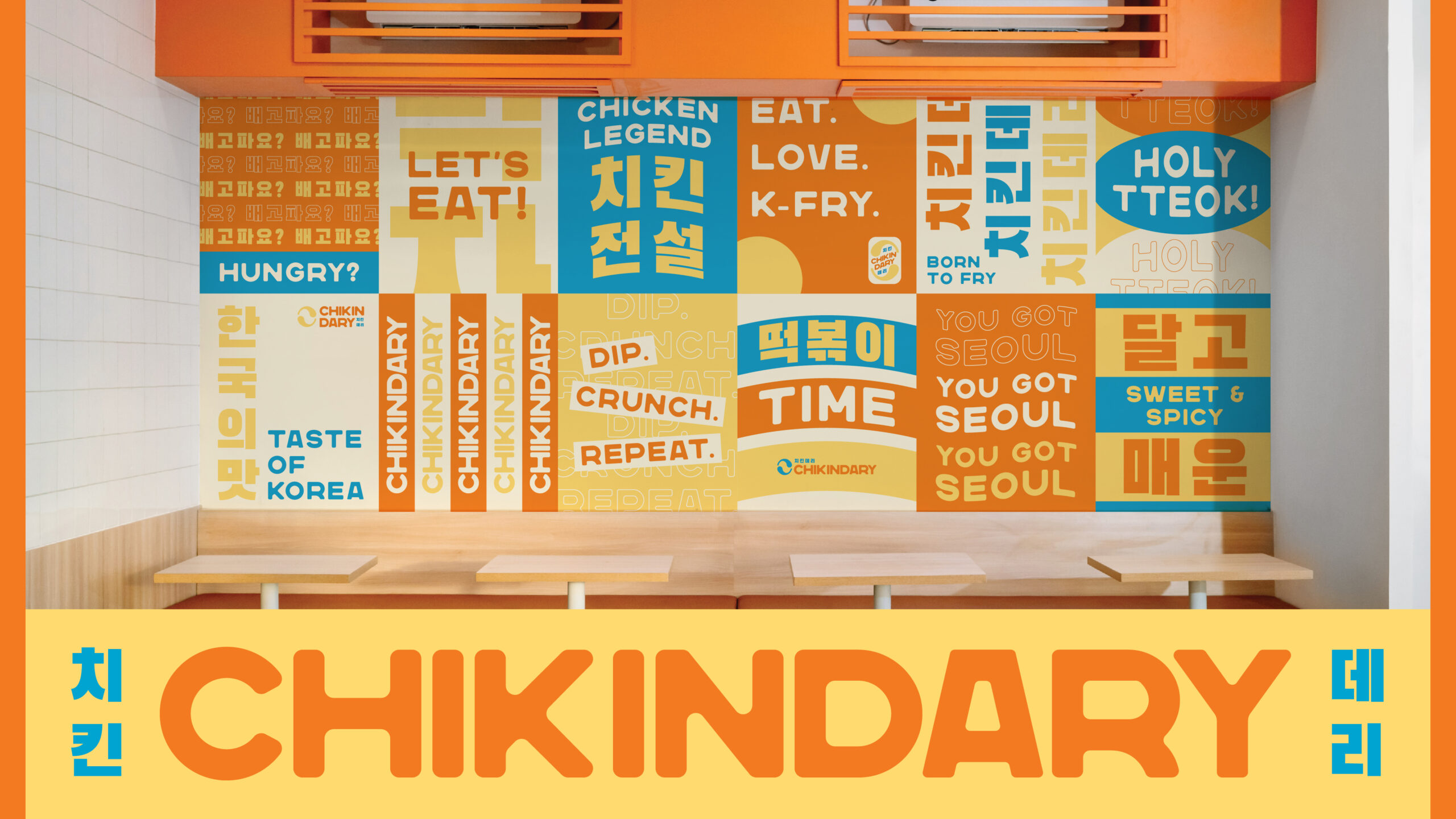
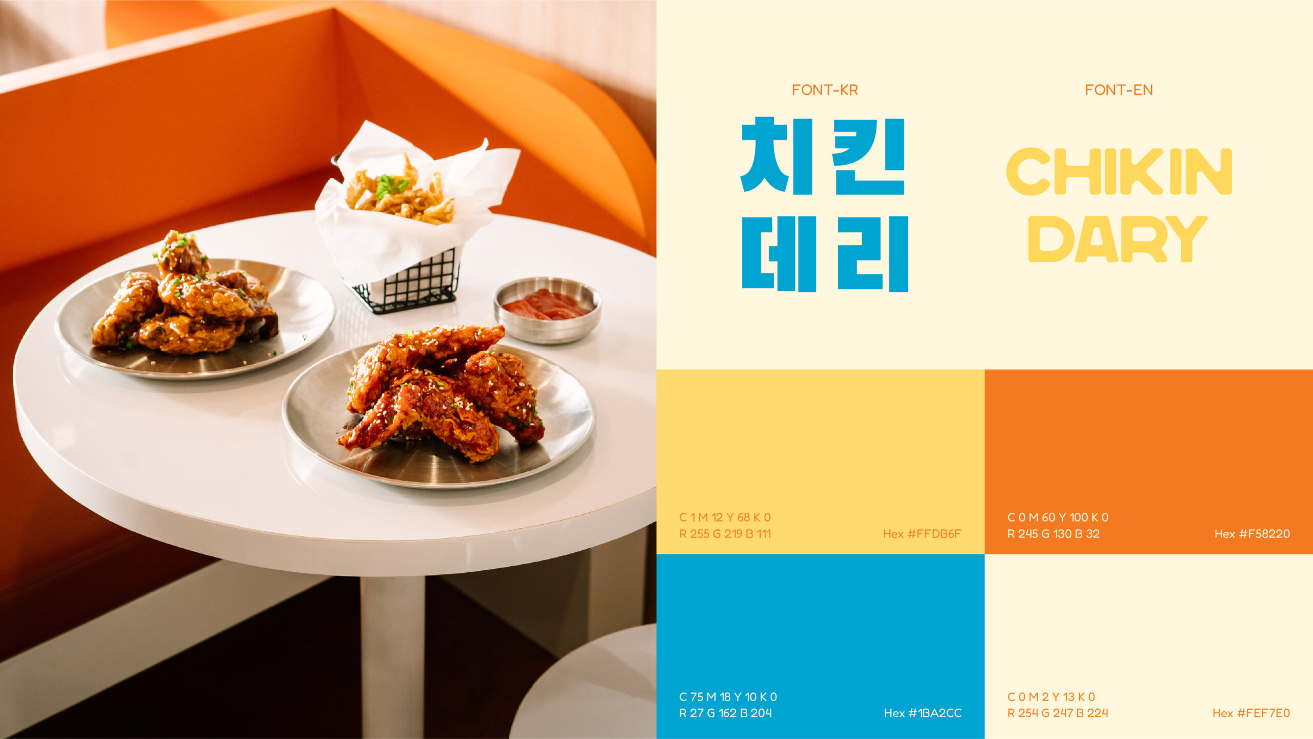
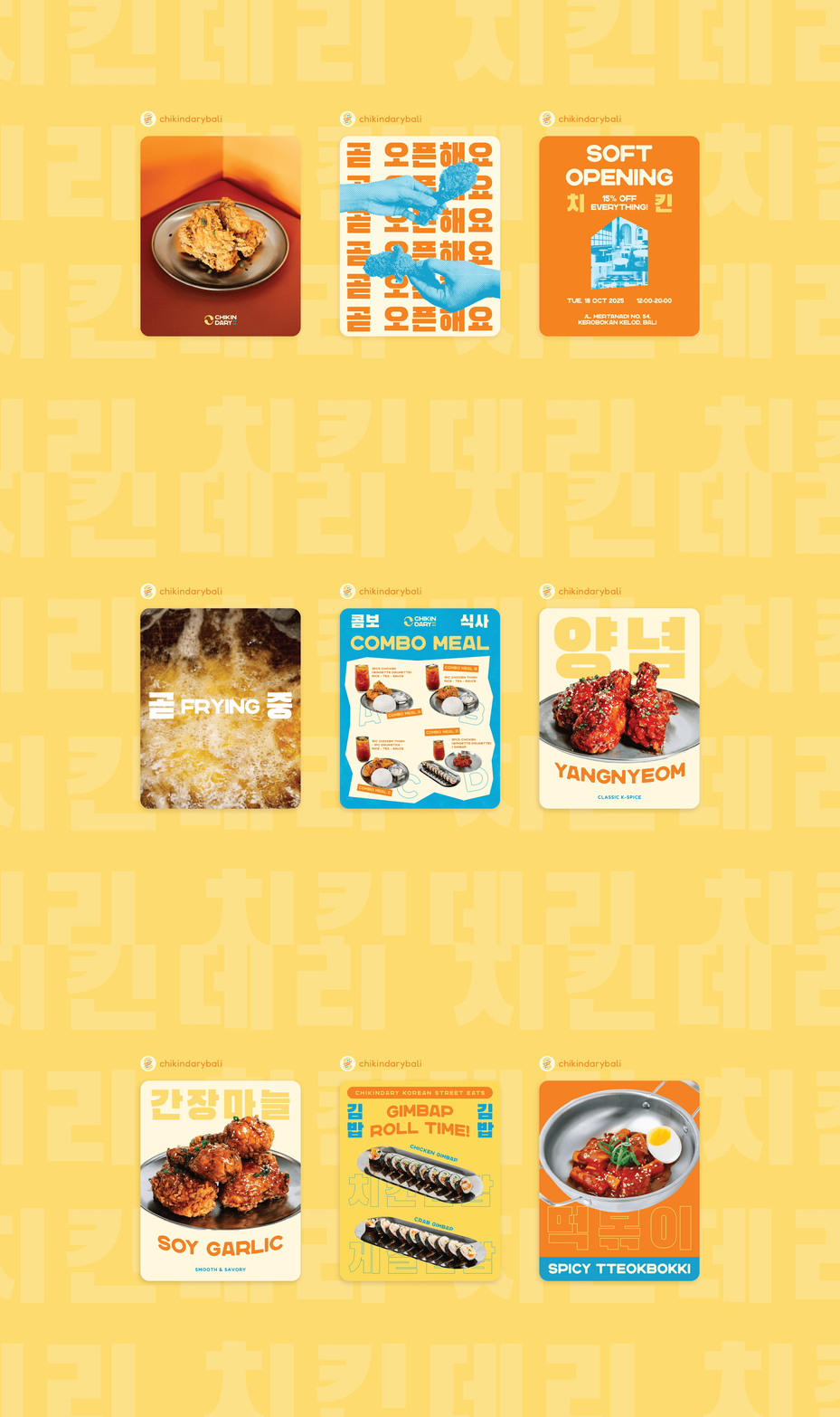
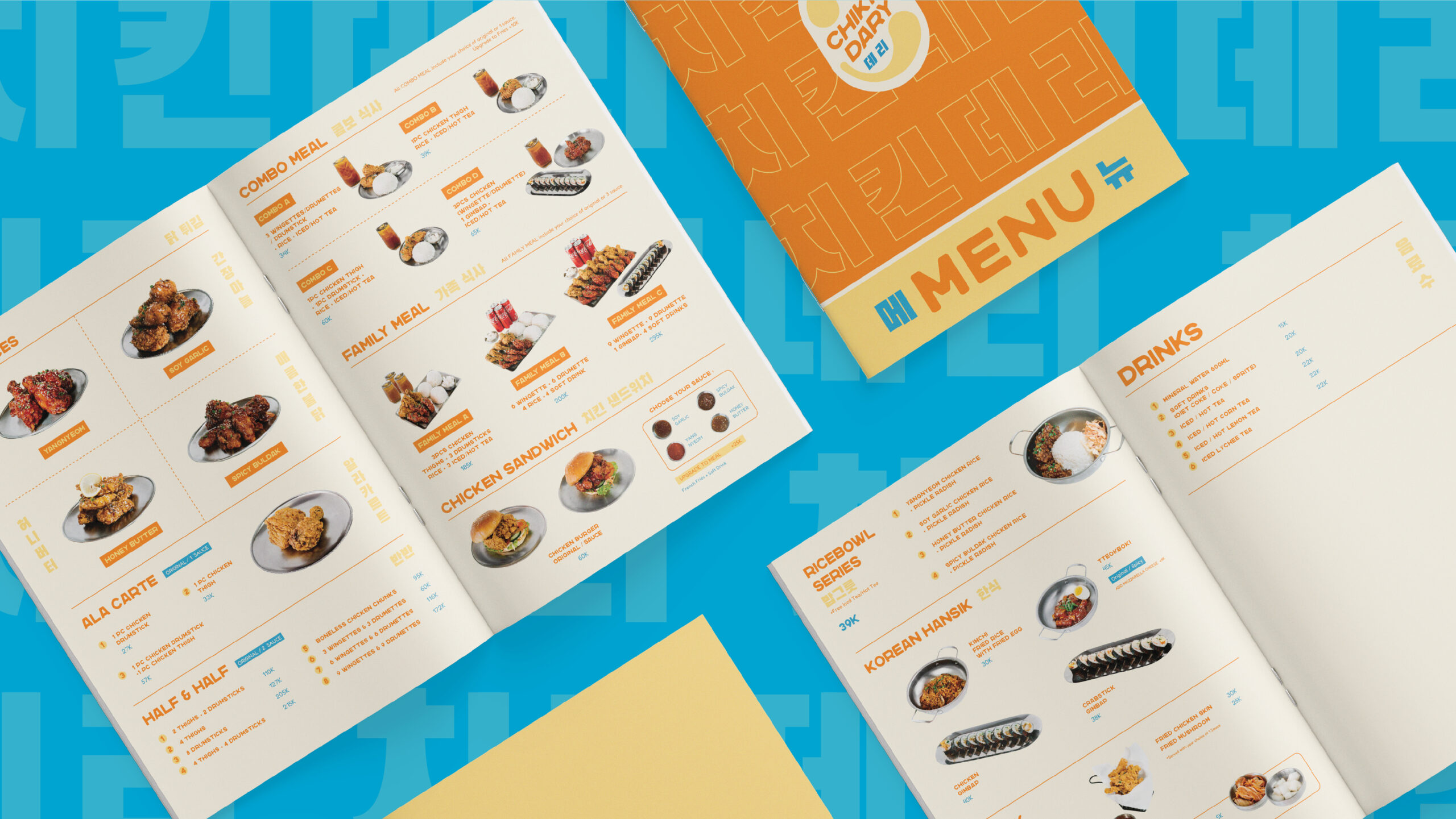
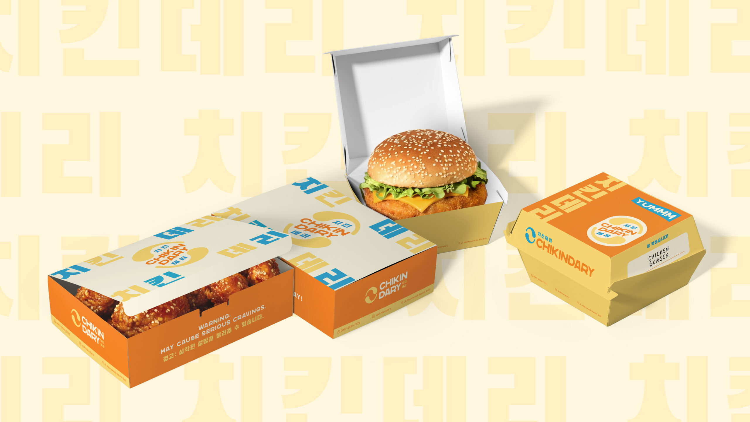
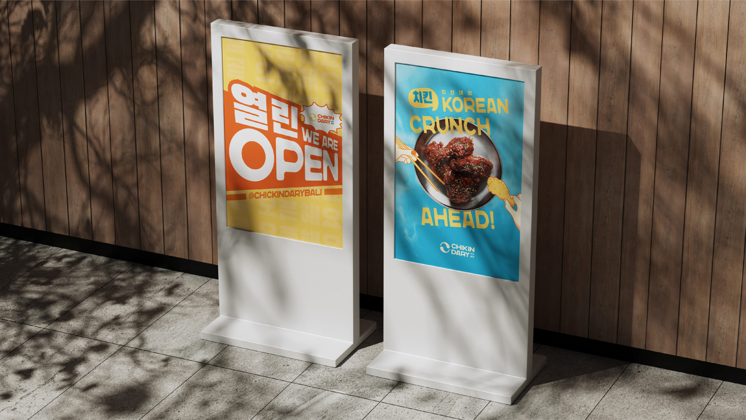
The design approach translates these values into a cohesive and scalable visual system. A soft cream foundation represents comfort and quality, while a sky blue, warm orange, and yellow accents bring playful energy and youthful vibrancy. The identity balances friendliness with clarity, creating a clean yet expressive brand that supports CHIKINDARY’s ambition to grow into a recognizable, franchise-ready Korean street-food destination.