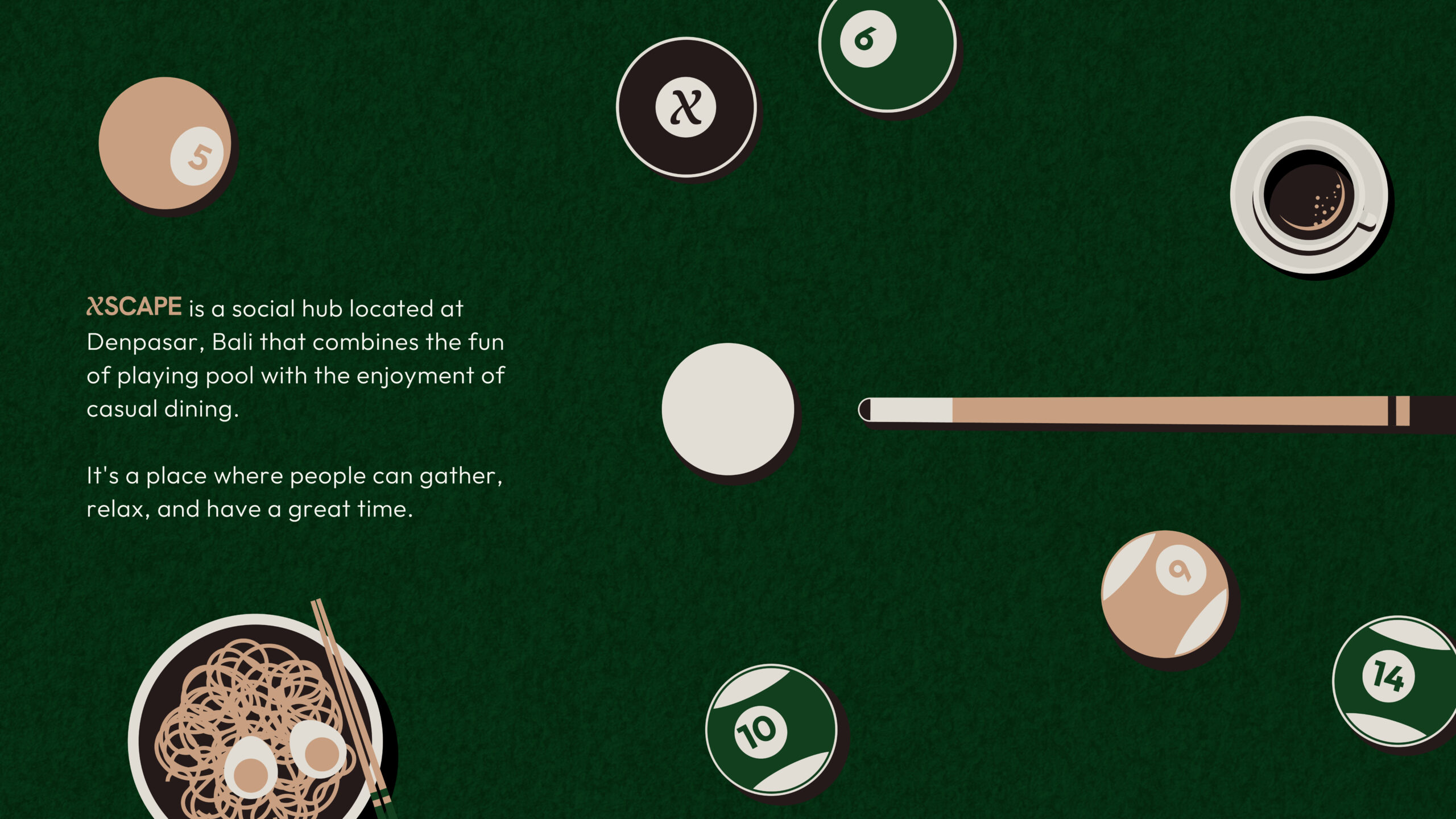
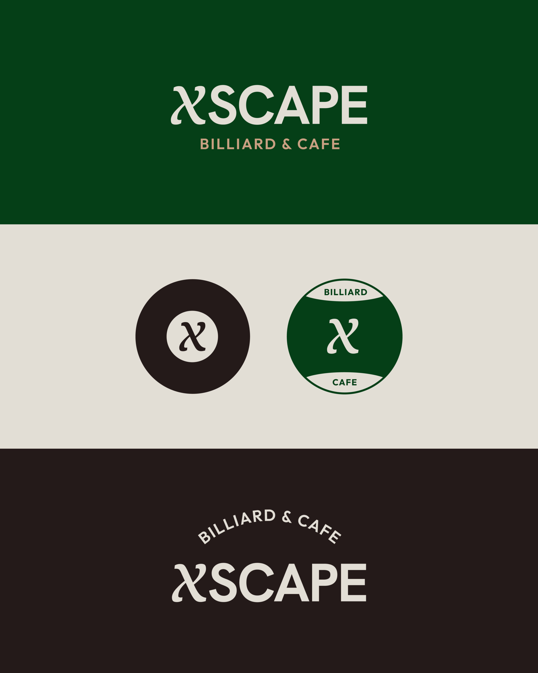
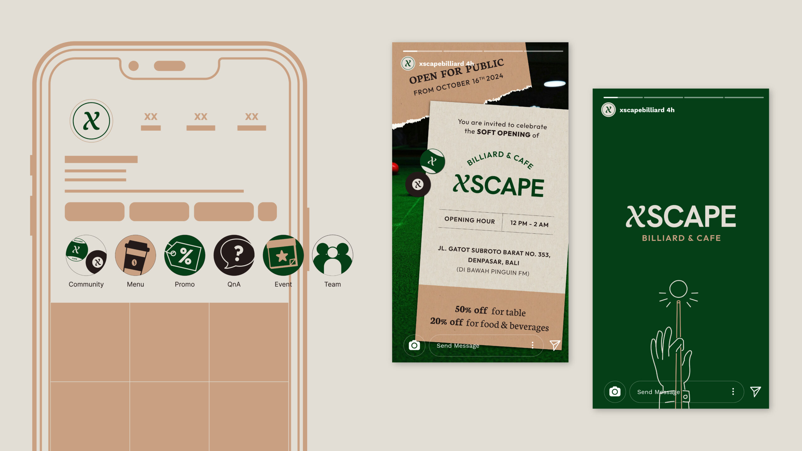
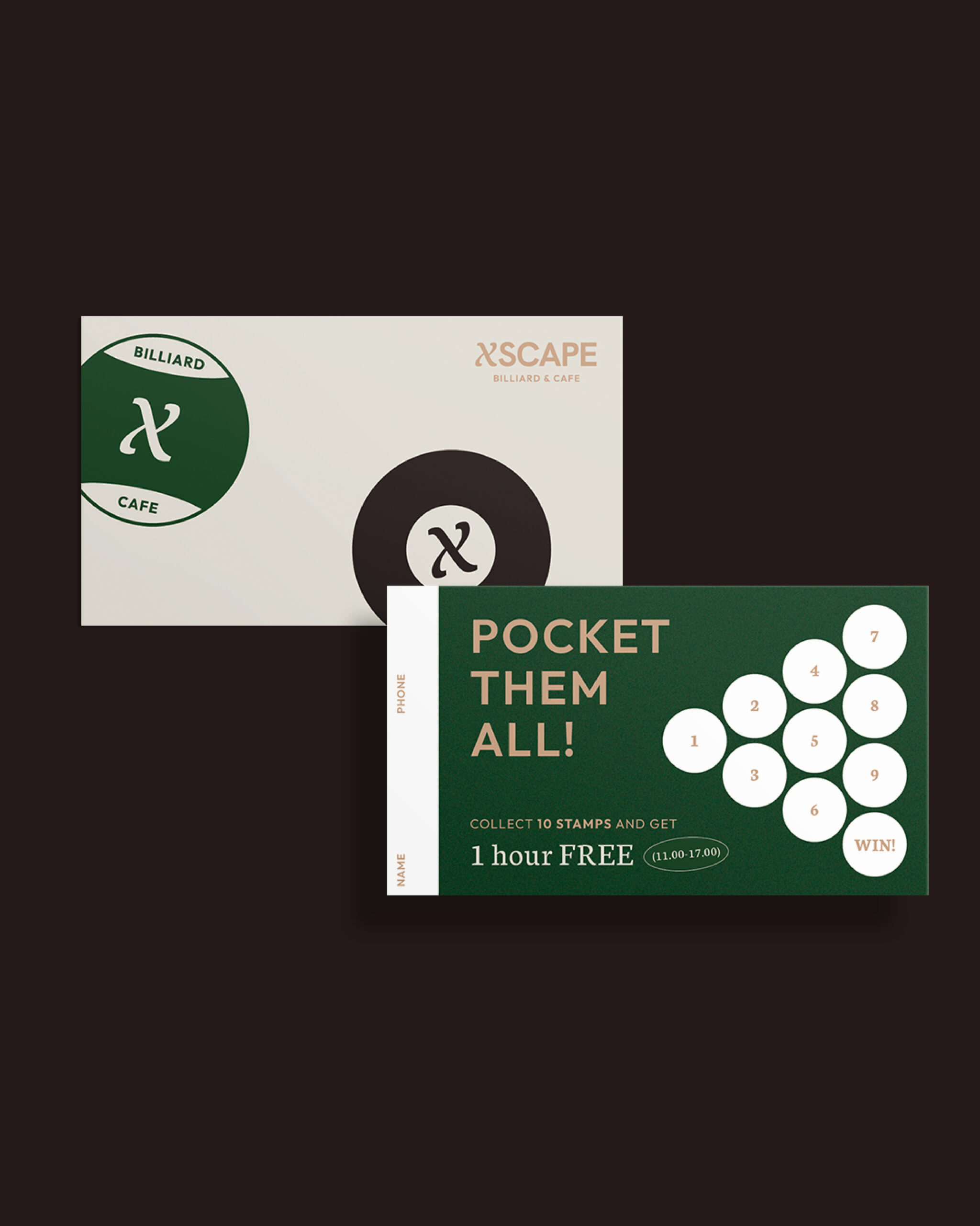
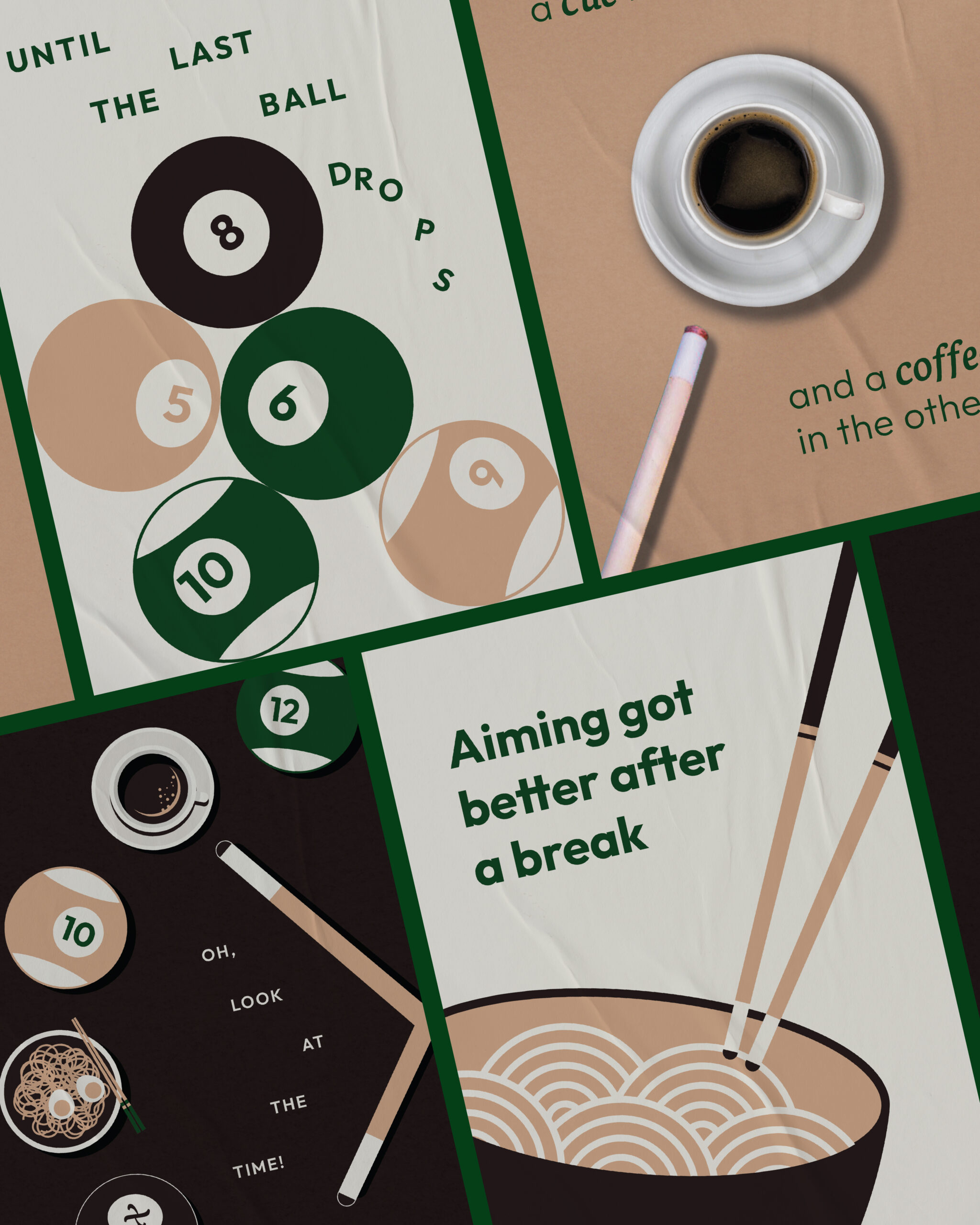
We crafted a brand identity that feels sharp yet easygoing, with forest green and soft beige tones that invite rather than overwhelm. The logotype draws inspiration from the curves and geometry of the game, while the supporting visuals use clean lines, warm textures, and playful messaging to reflect a more approachable experience. Whether you’re sinking the 8-ball or just enjoying a casual bite, XSCAPE is designed to feel like a place everyone can come to — no pressure, just good times.